The aim of this project was to develop a breast cancer awareness campaign for a non-profit organization, fostering a fresh identity that inspires both young individuals and survivors to openly share their stories.
VIEW PDF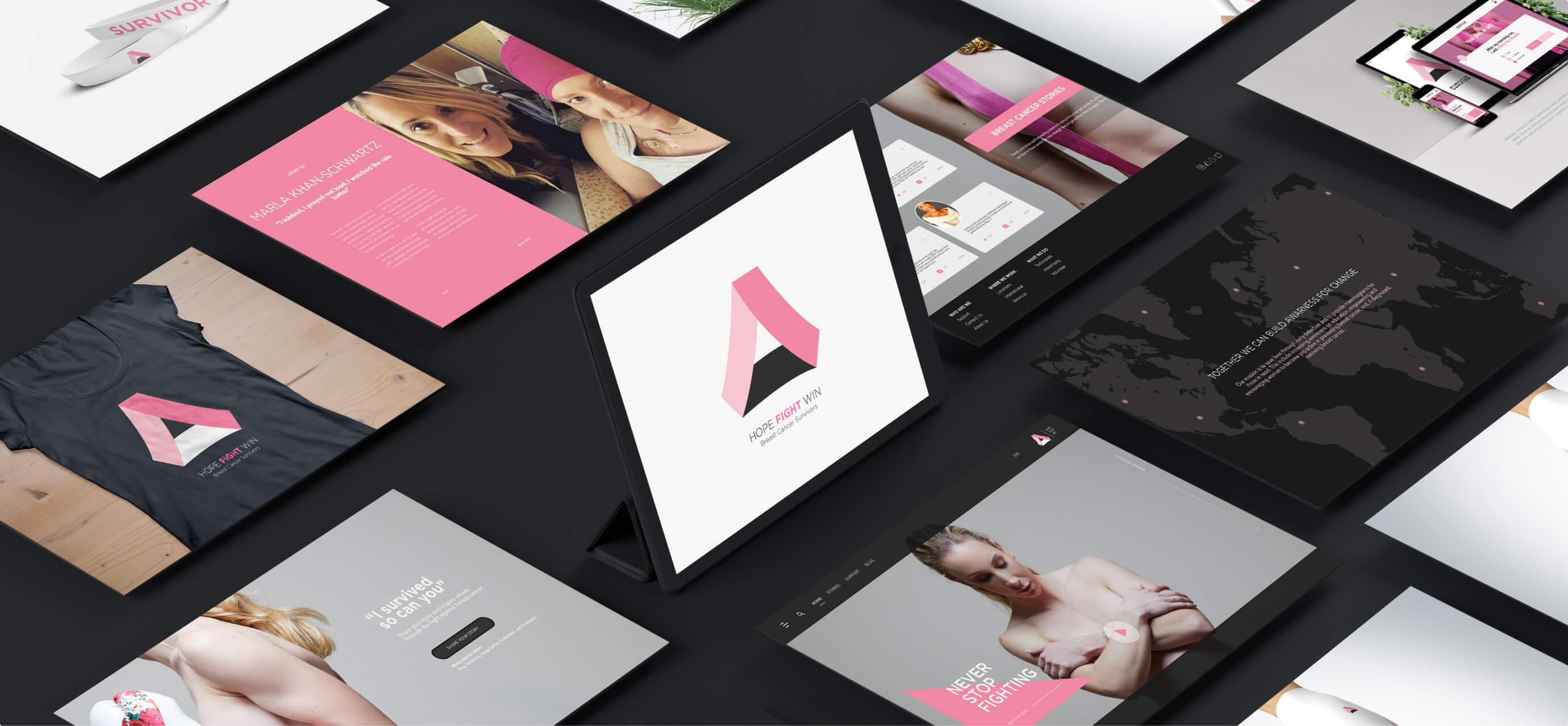
In the 1800s, women adorned yellow ribbons as a symbol of honor for family members in the military. Consequently, pink emerged as the color of choice for those battling breast cancer over the years. Today, charitable organizations continue to employ this strategy to raise awareness.
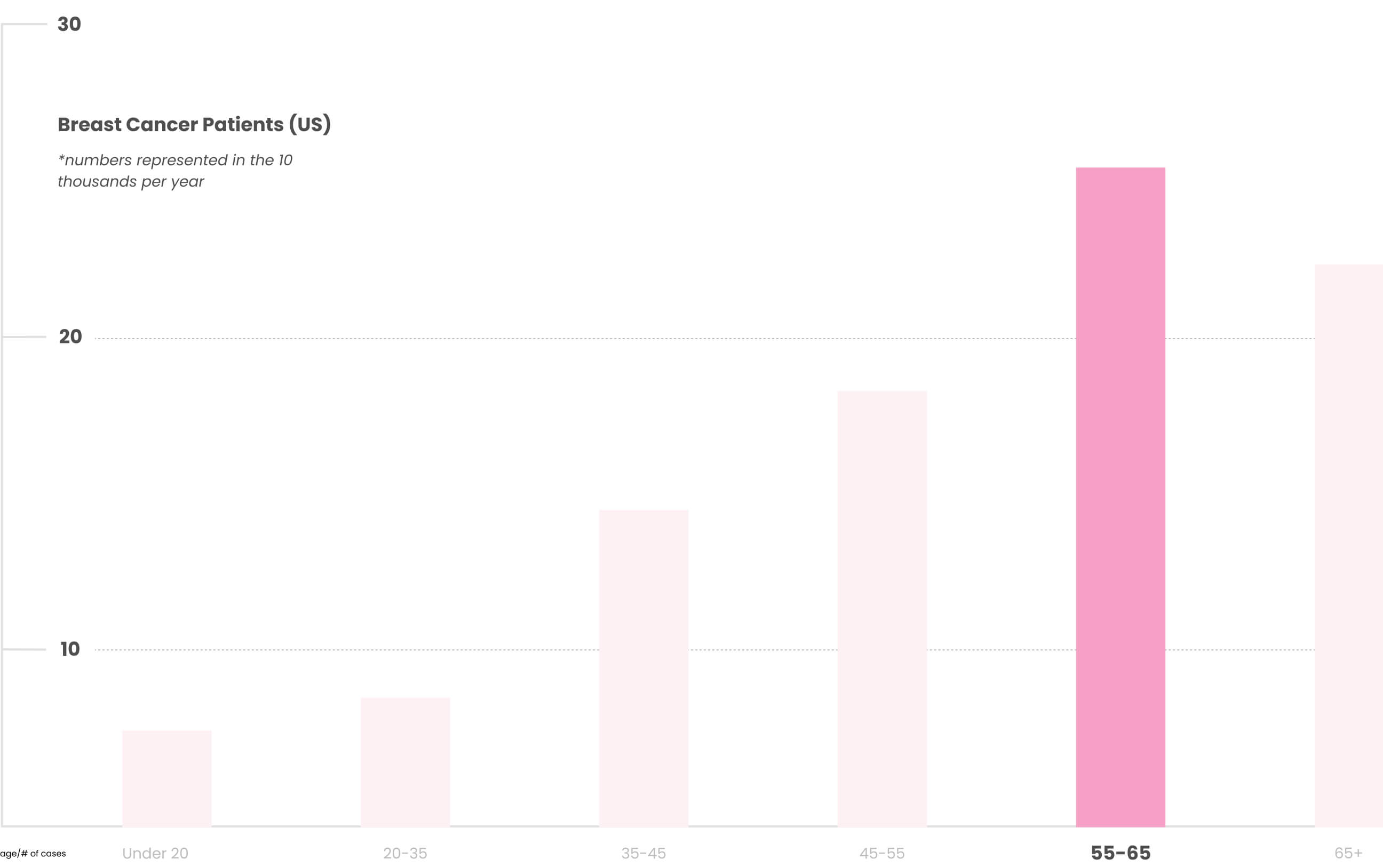
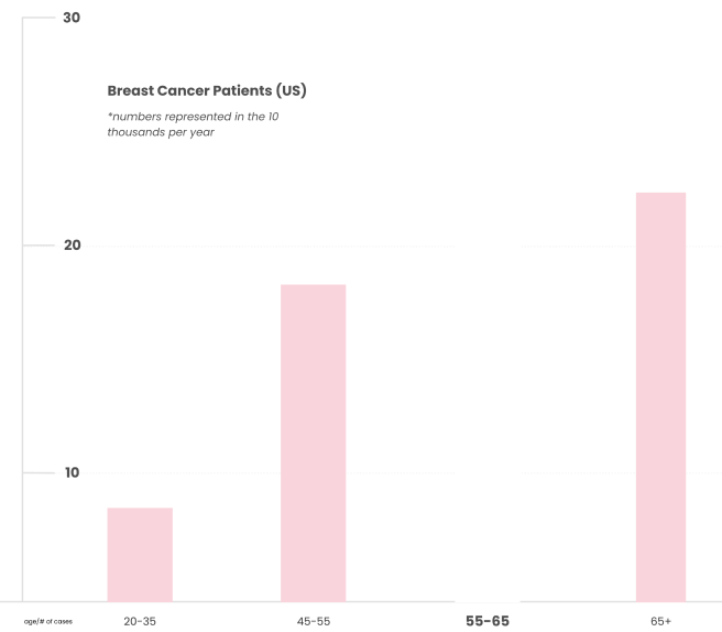
Breast cancer is statistically more common in women over the age of 50, while some age groups are at lower risk. Bearing this in mind, it's possible that the new initiative could help reduce the prevalence and educate a younger audience about prevention methods.
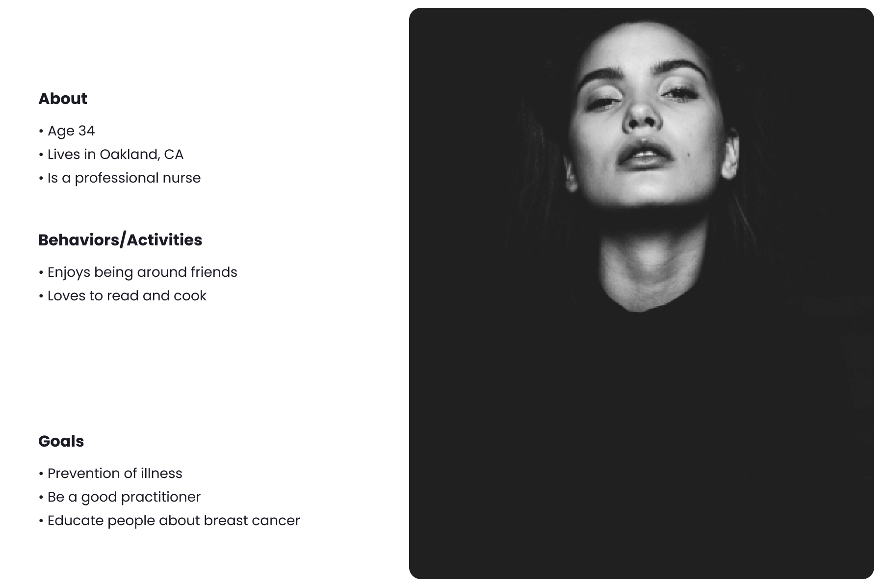
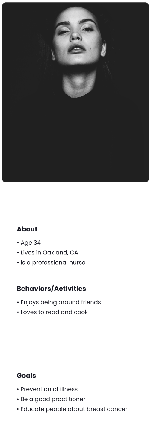
I crafted a persona embodying the traits of a breast cancer advocate. This archetype offered a deeper insight into the intended target audience.
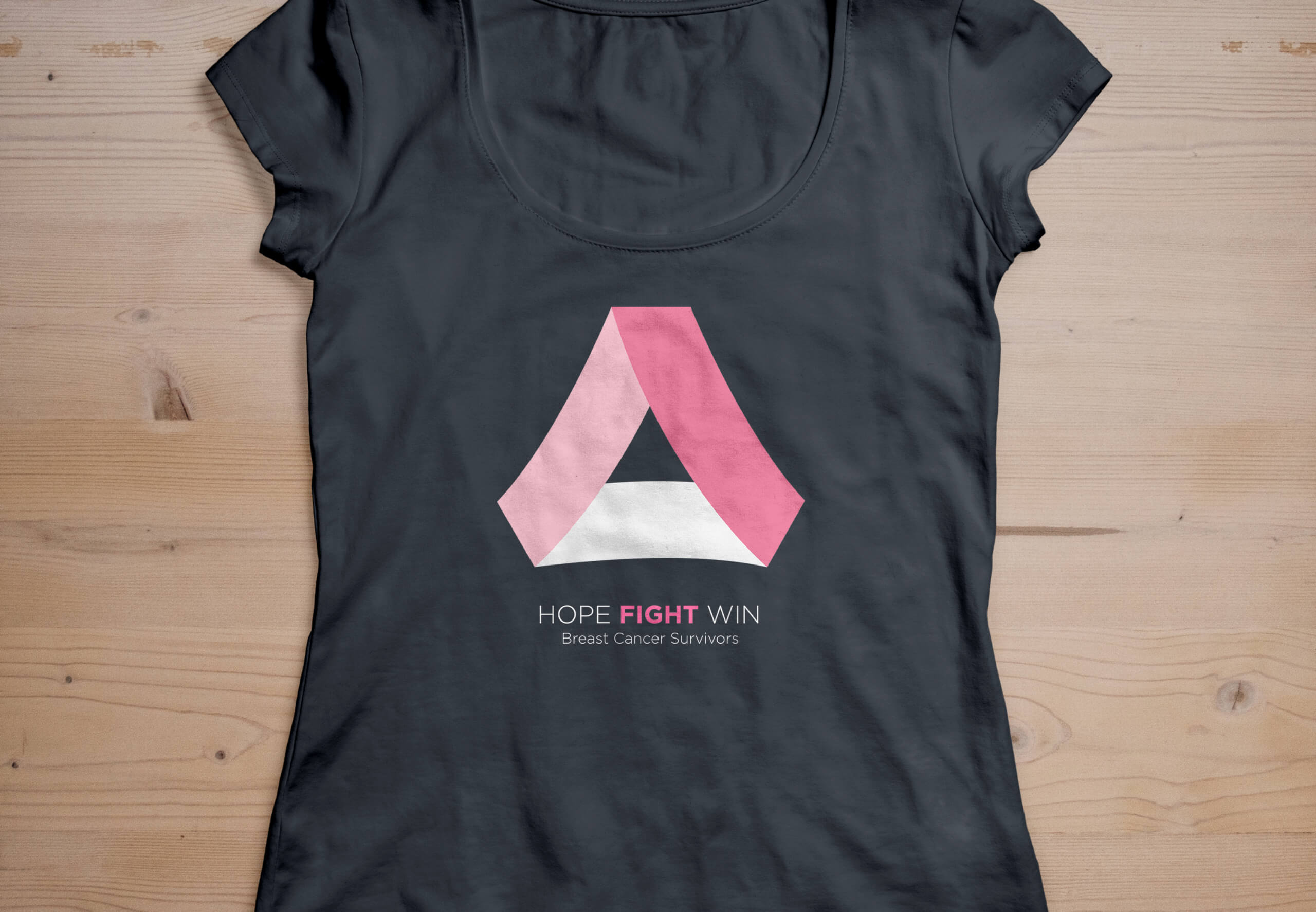
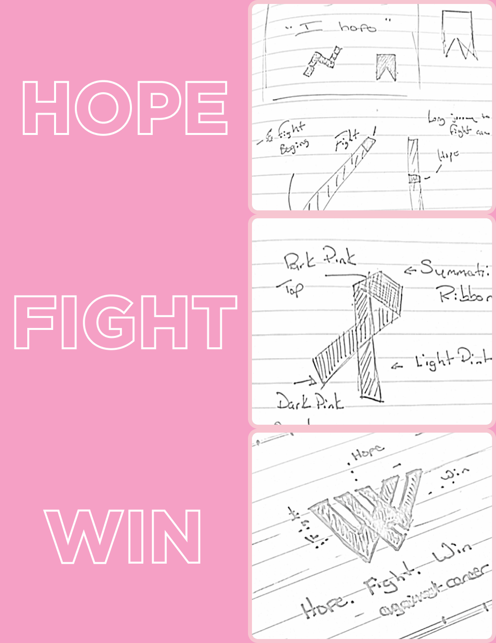
I compiled a list of keywords for creating a campaign tagline. "Hope" spurs action, "Fight" fosters resilience, and "Win" inspires success. Following this, I sketched potential logos that best encapsulated each word.

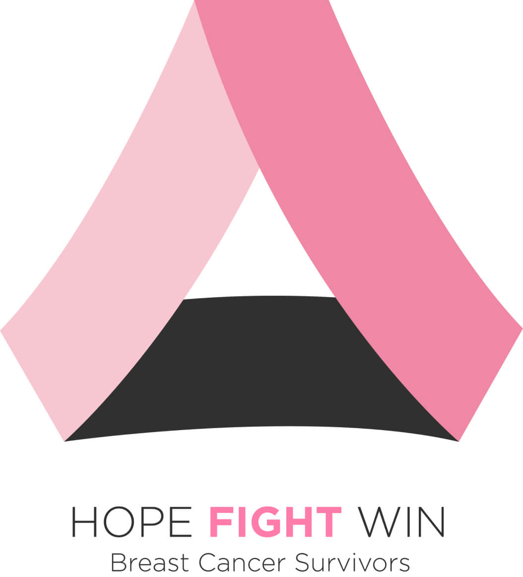
In my design, pink was the prevalent color. Historically, pink has strong ties to breast cancer awareness and self-esteem. Additionally, I aimed for a conventional sans-serif in both regular and bold weights. Therefore, the final logo amalgamated these components with the selected rough sketch.
I refined the logo to improve its functionality. Next, I created a webpage for survivors and patients to share their stories. However, I quickly realized that my efforts didn't need to stop there.
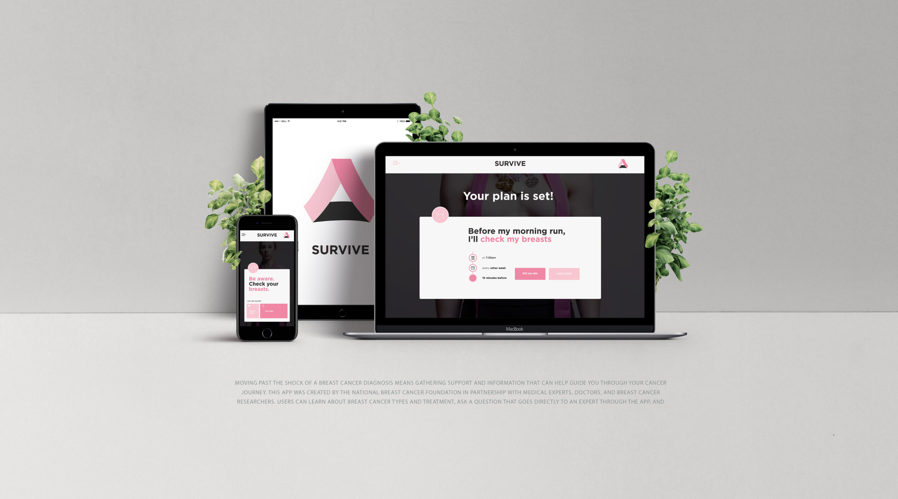
I designed a webpage dedicated to monitoring and reporting mammogram results. Furthermore, advocates can utilize the forum to exchange their personal stories and experiences.
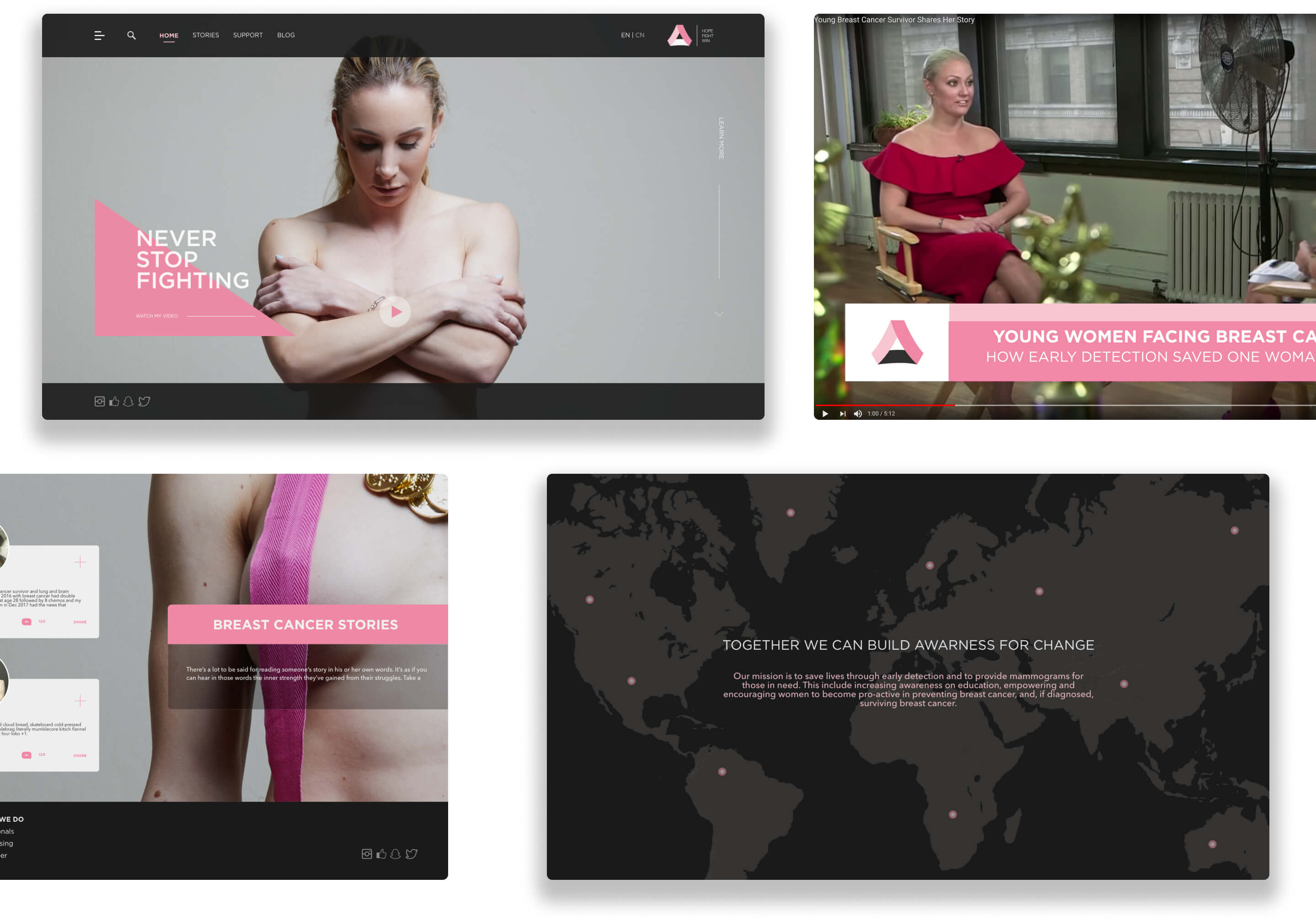
After careful consideration, I decided to photograph a model who consented to be part of this project. With a concept in mind and a supportive team, we ultimately created three posters to engage a broader audience.
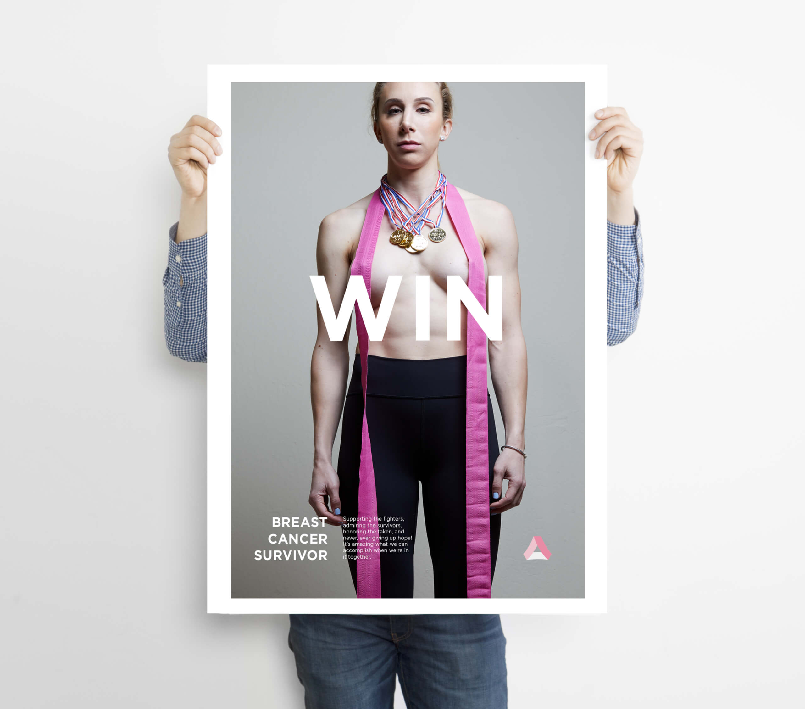
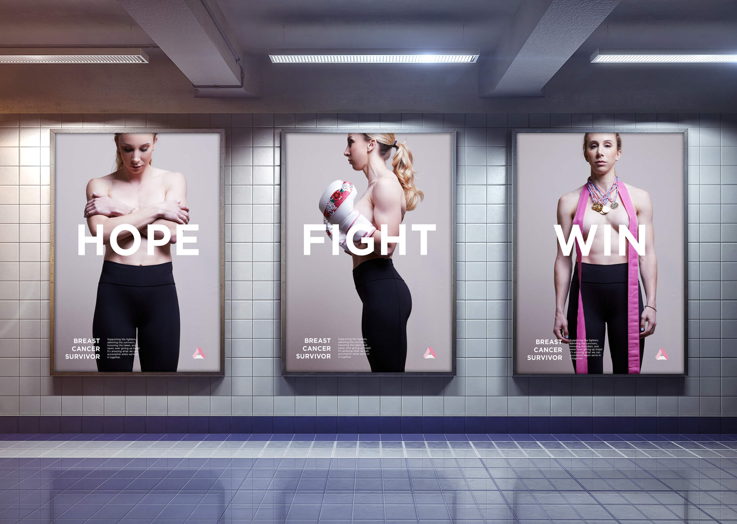
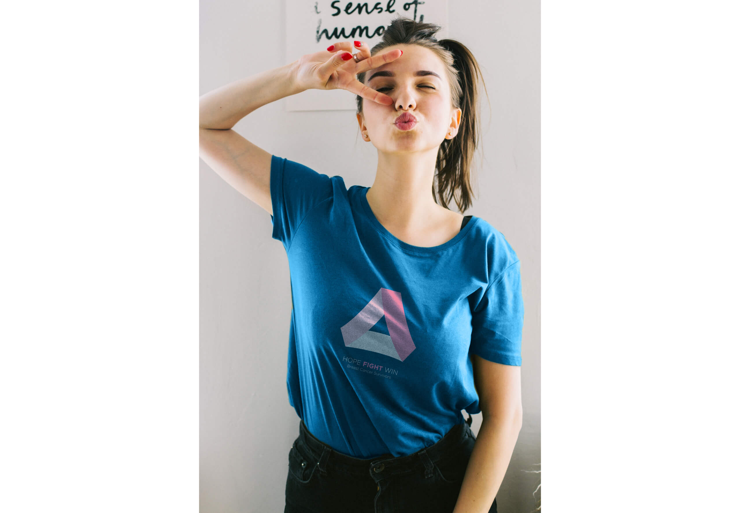
While posters and billboards have long been effective tools for raising awareness, I took our initiative a step further by creating a dedicated line of apparel. Now, you can carry the cause with you wherever you go!
