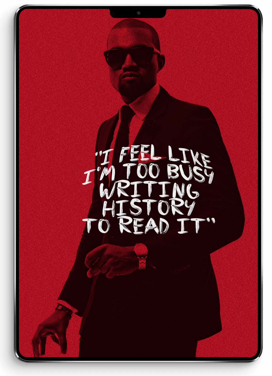
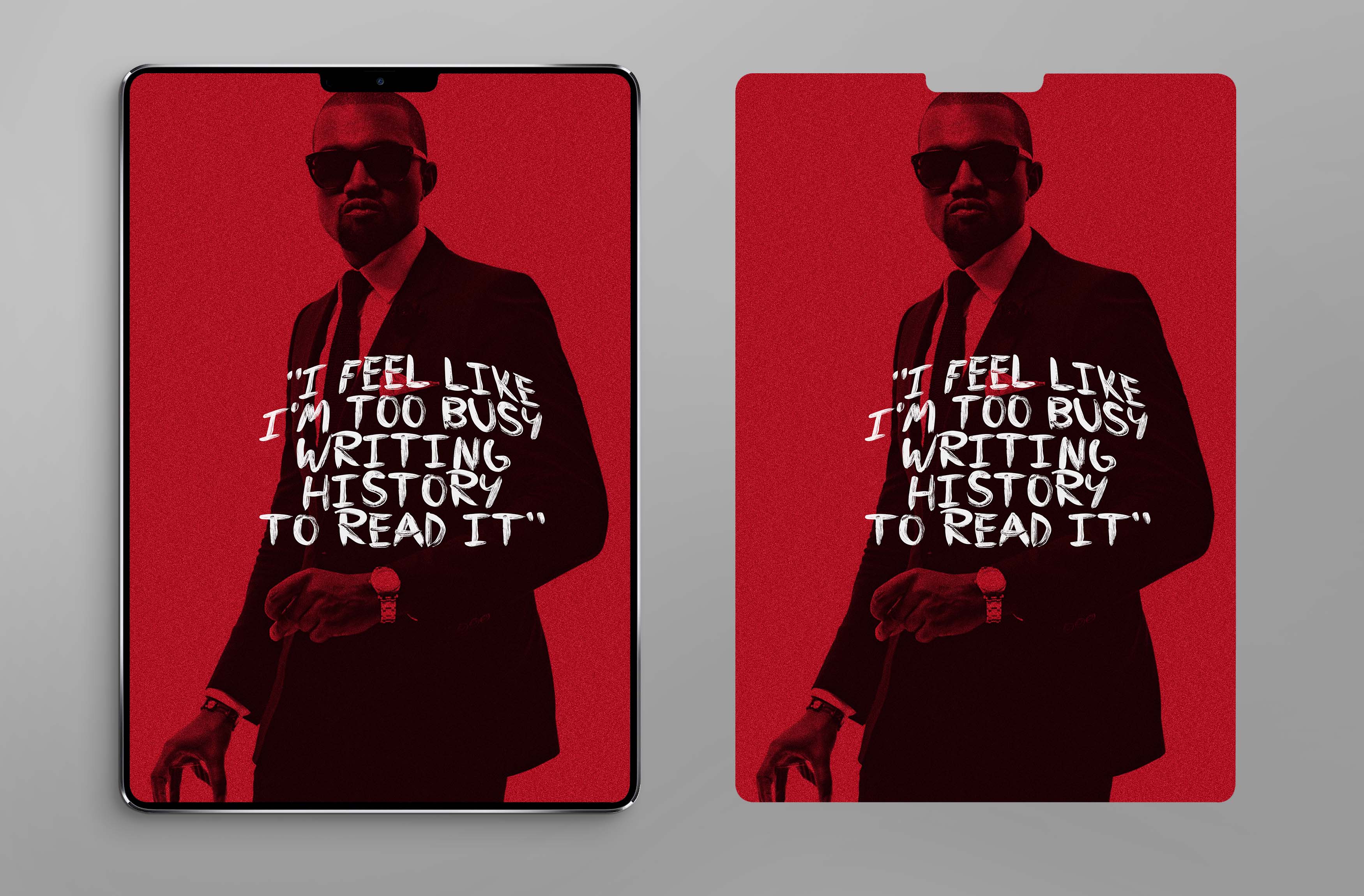
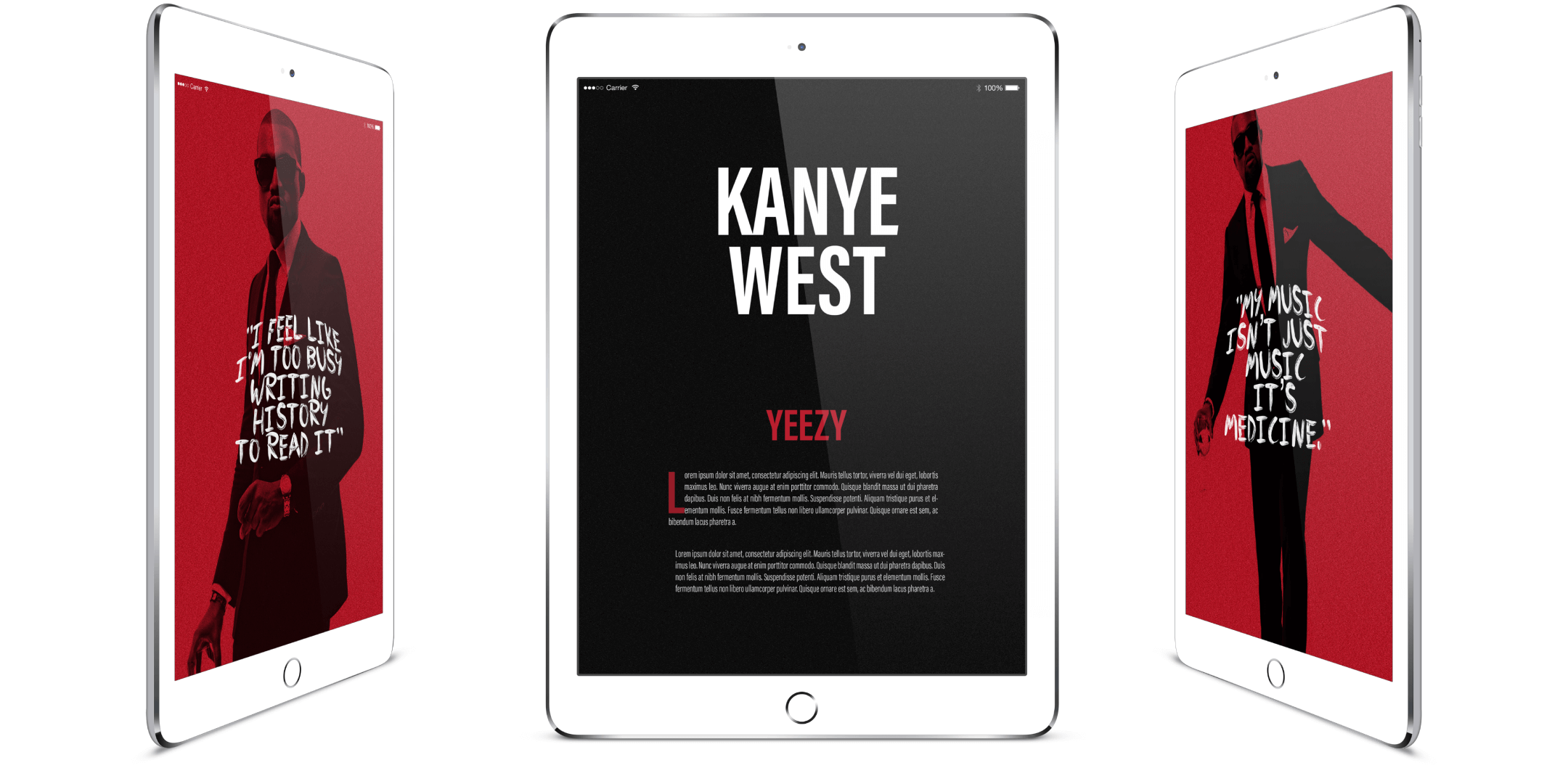
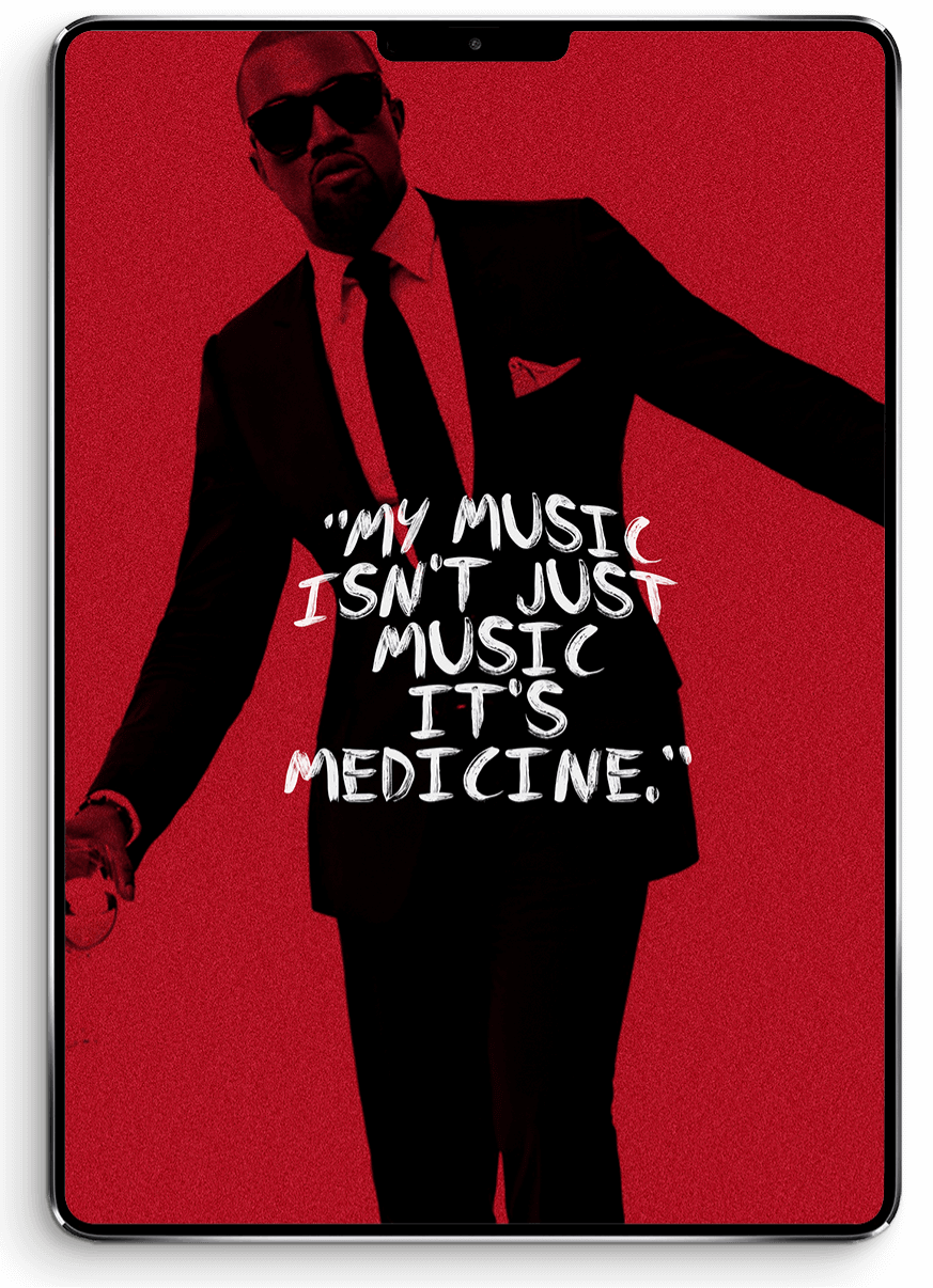
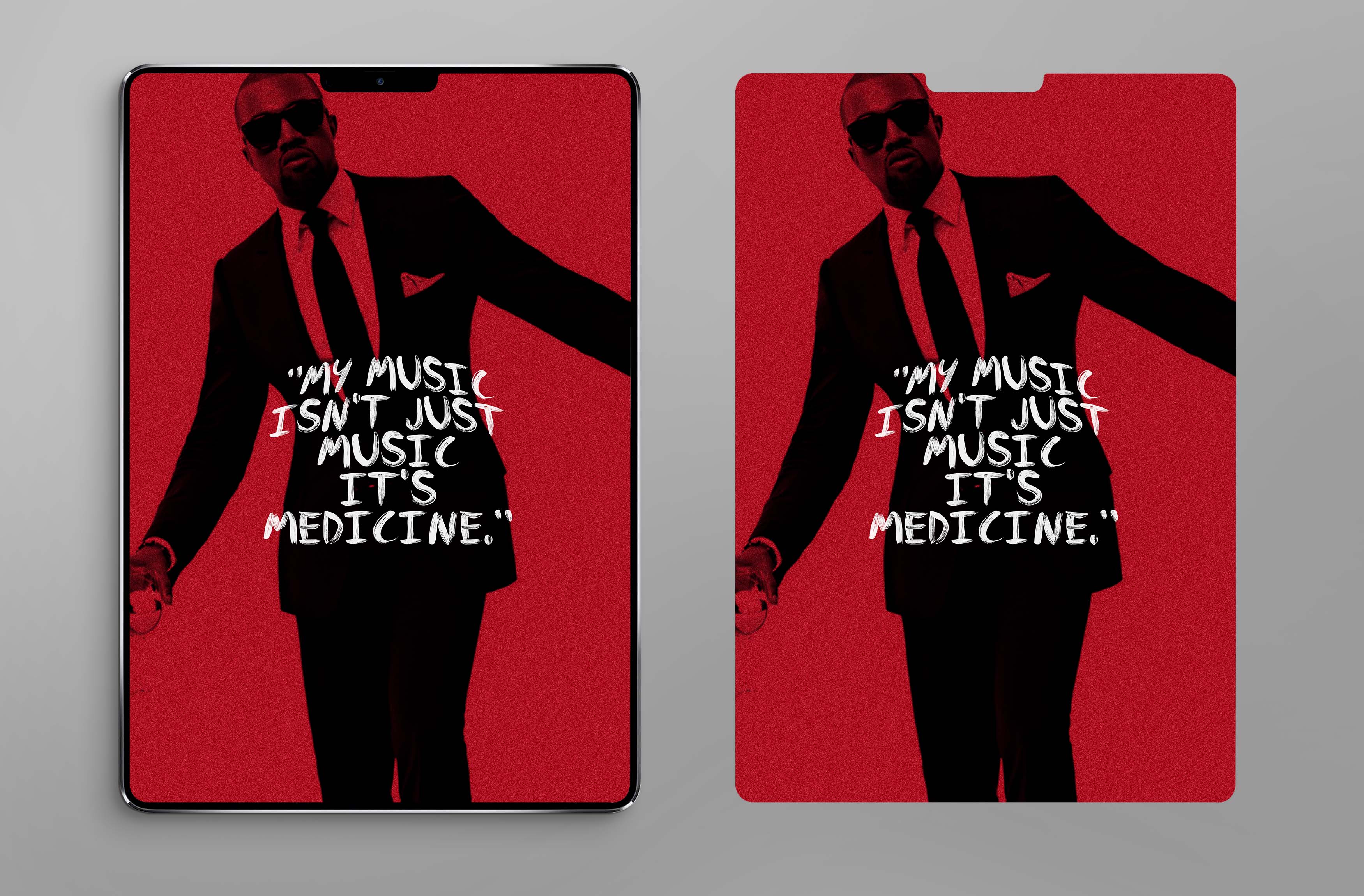
A layout design for Complex Magazine's digital and print editions, inspired by my favorite music genre.
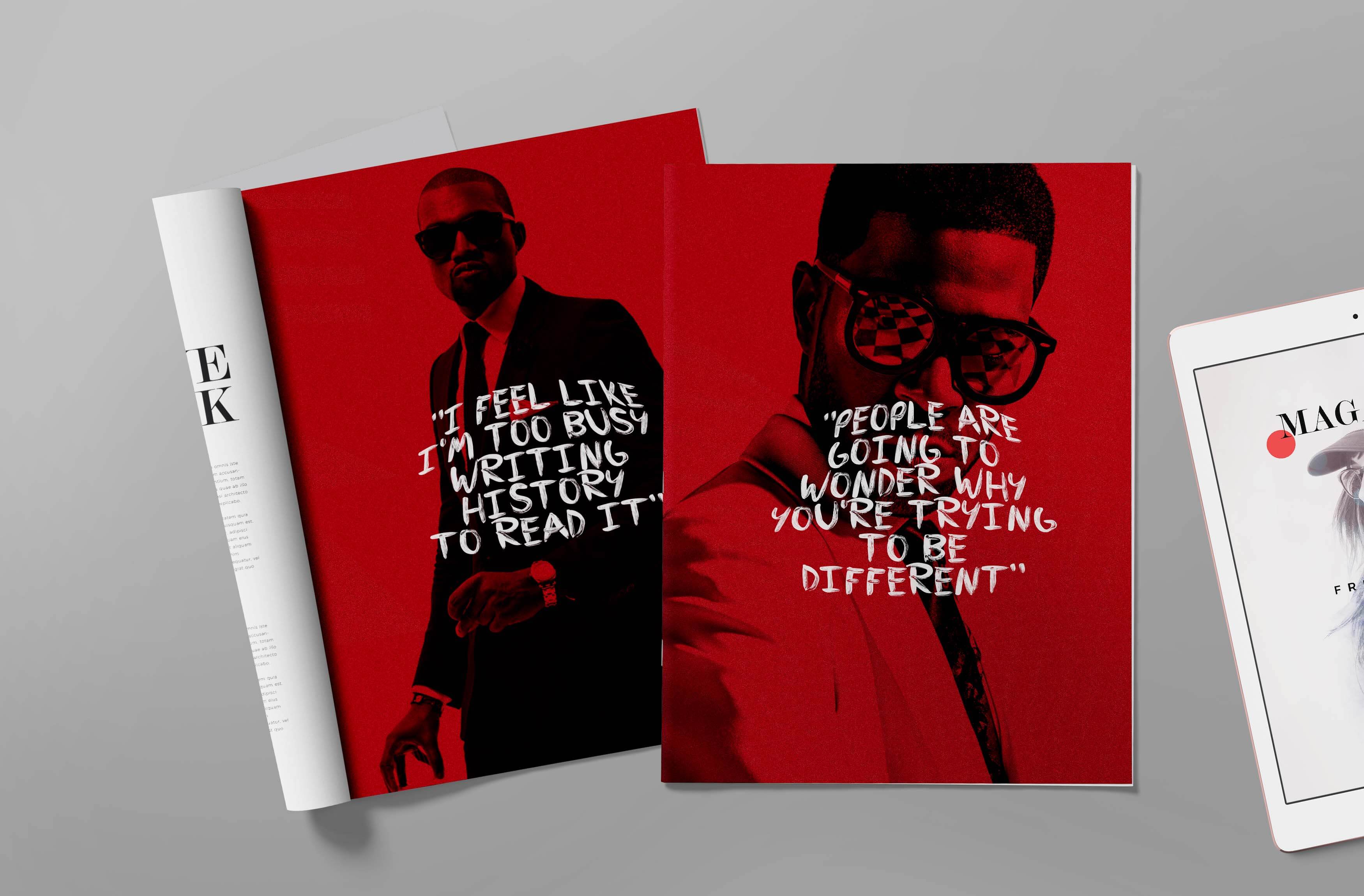
I applied different hues of red to the main image using monochromatic methods. To add texture, I wrapped the typeface in a pattern that complements the overall design. Finally, I arranged the spread in a two-column format to enhance readability.
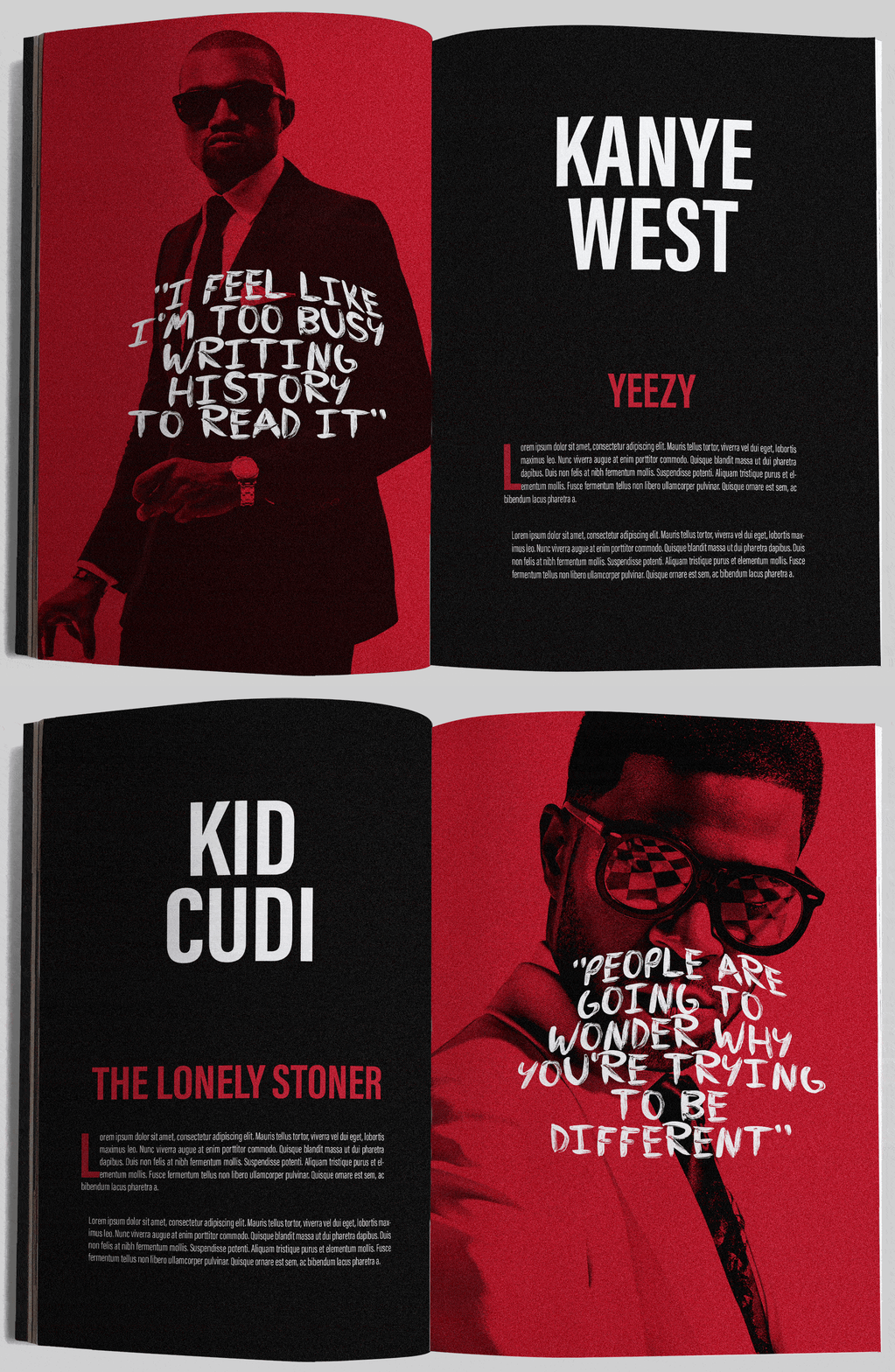

Much like the print edition, the layout is user-friendly, whether viewed on a computer or another digital device. Yet, the potential is virtually boundless when we incorporate interactive features.
