The objective of this project was to choose a brand and revamp its logo. My approach was straightforward: I decided to stay rooted in our local community and pay homage to it.
VIEW PDF

As one of the world's oldest, largest, and most respected cannabis retailers, Harborside has played a crucial role in making cannabis safe and accessible for a diverse community of consumers in California.
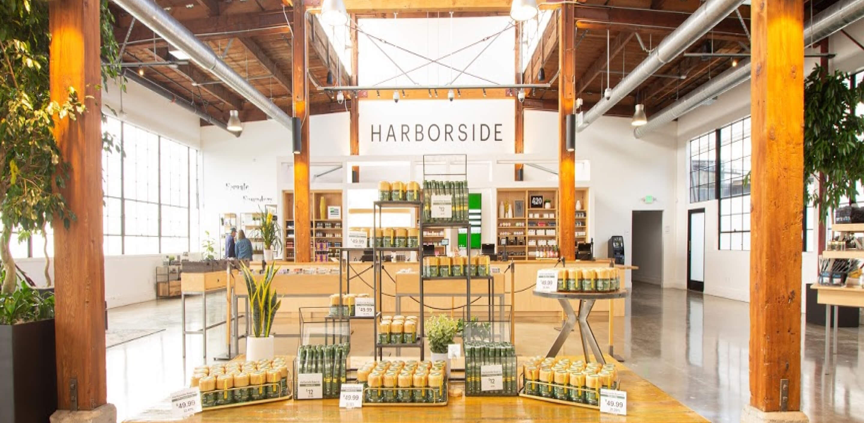
During my formative years, I completed the majority of my schoolwork either in a cozy coffee shop or at a nearby deli. These establishments have long been pillars of our community, providing sustenance and a convenient meeting place. Therefore, as I explore fresh ideas for reimagining Harborside's logo, my aim is to reciprocate their support by giving back to the community.

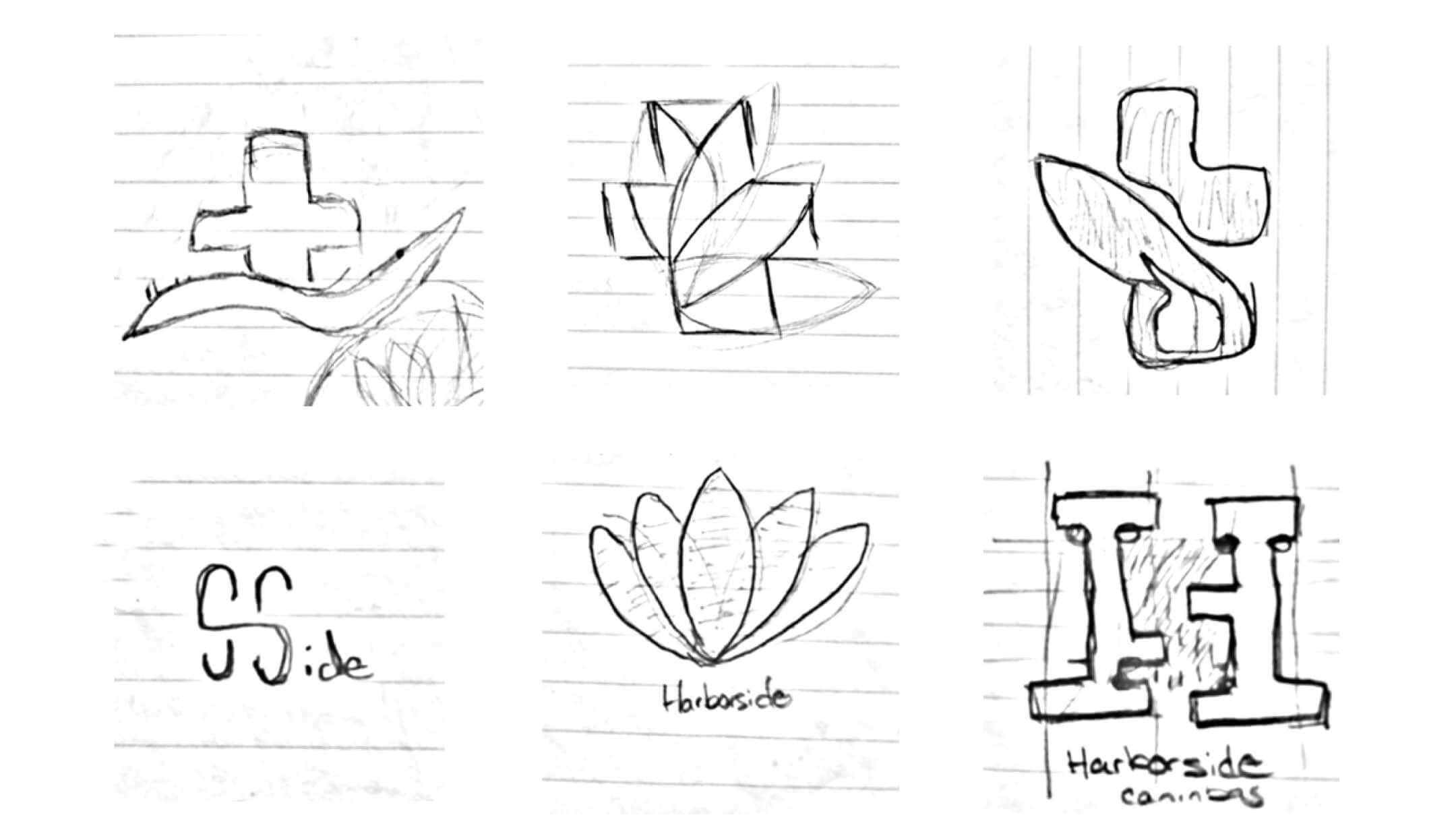
A passion for the brand and creative thinking fueled the design and execution of this project. I began by selecting photos that best represented the business. Then, I made preliminary sketches to create the logo.


Rather than crafting a new color palette, I decided to maintain the existing one, only renaming each color for clarity. For typography, I selected Gotham, a typeface that exudes comfort and accessibility.


Drawing inspiration from the cannabis plant and what it symbolizes, I took basic elements from the original logo, a leaf and the medical symbol, and was able to design three logos that best represented the brand.

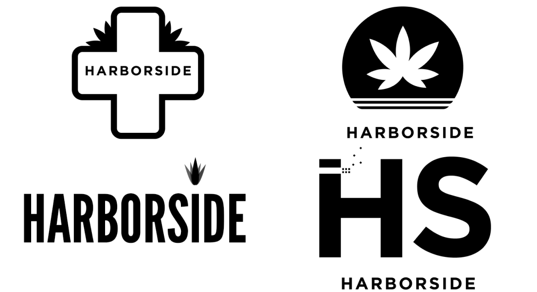


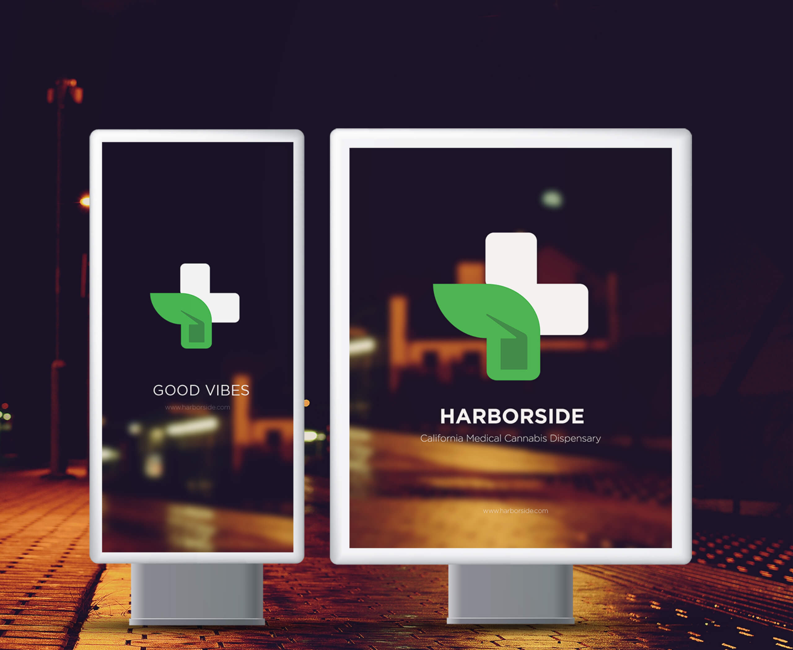
The new logo presents a fresh look. The leaf symbolizes the brand's affinity for cannabis, while the medicinal cross signifies their commitment to help. The subsequent samples display how this new logo can be applied in various contexts.
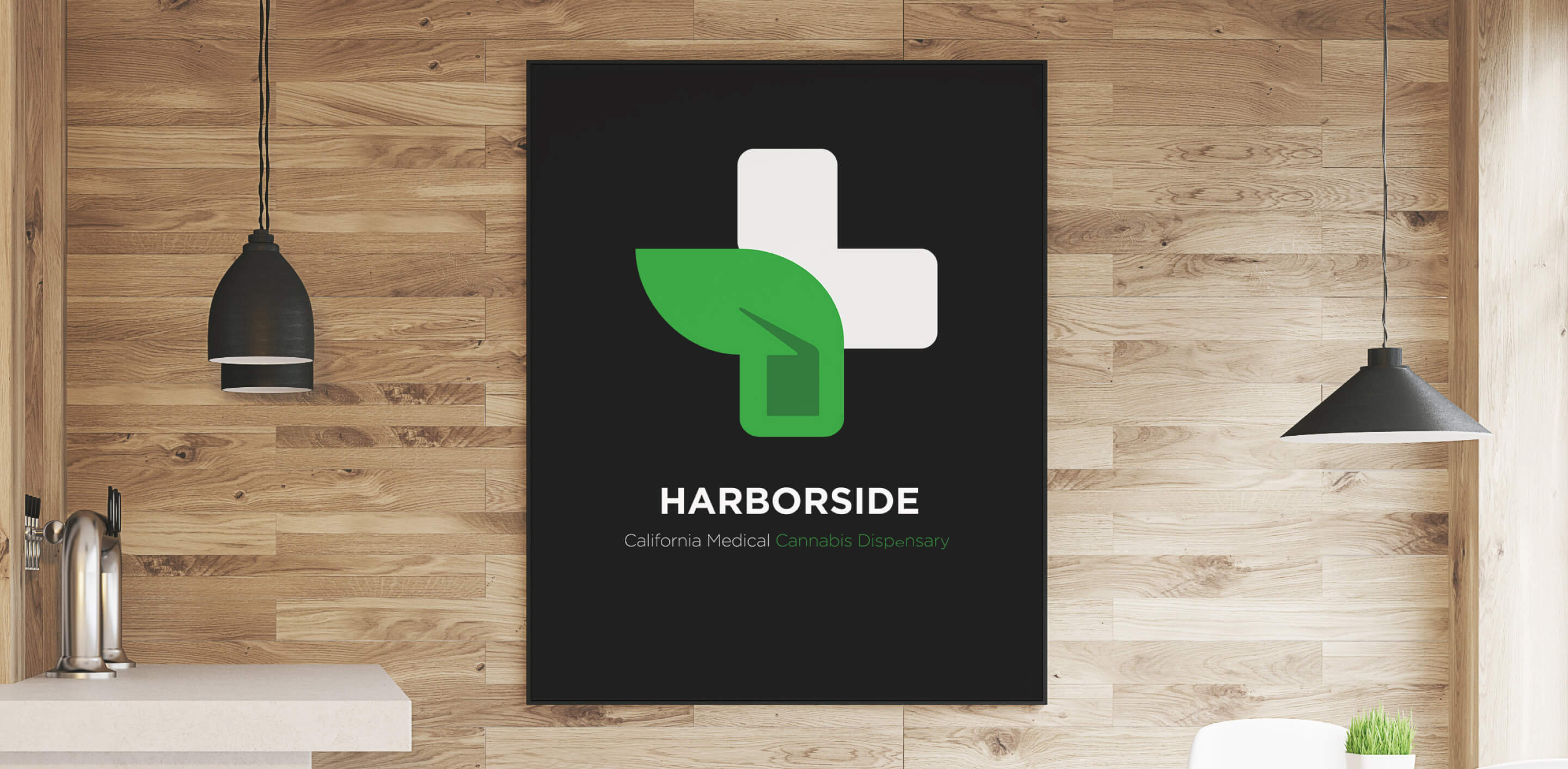
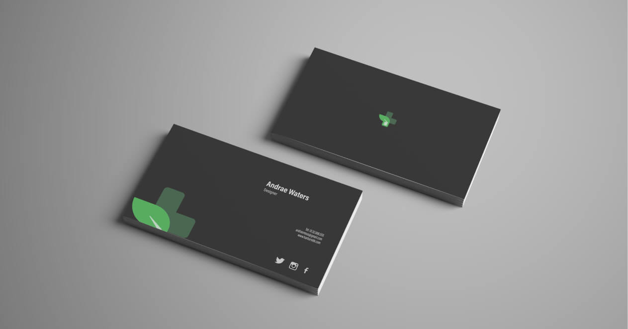
Standard office supplies, such as posters, business cards, and letterhead, with the new logo.


I found it enjoyable to leverage the renowned trademark in crafting the design for both the interior and exterior spaces. The accompanying images demonstrate the expansion of a smoking lounge, providing consumers with a welcoming environment t socialize with fellow enthusiast.


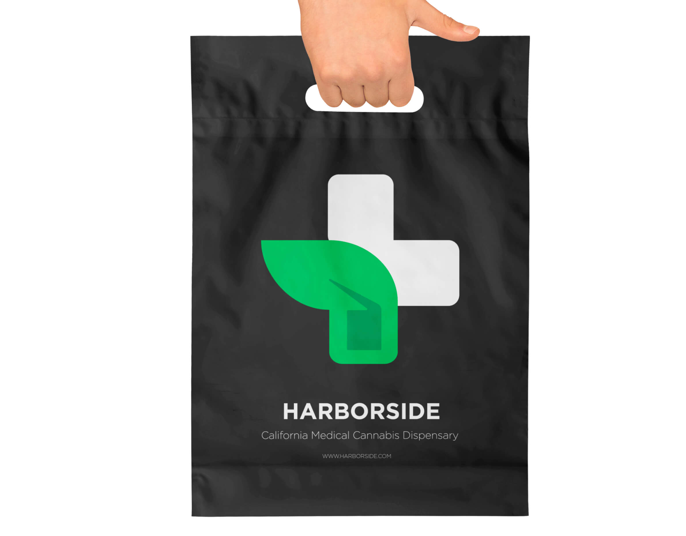
Strategically placing the logo on bags and packaging enhances the shopping experience, creating a lasting impression and fostering brand loyalty. This branding strategy can rekindle customer interest and ensure their continued support by making each shopping interaction engaging and memorable.

